Inline Editing
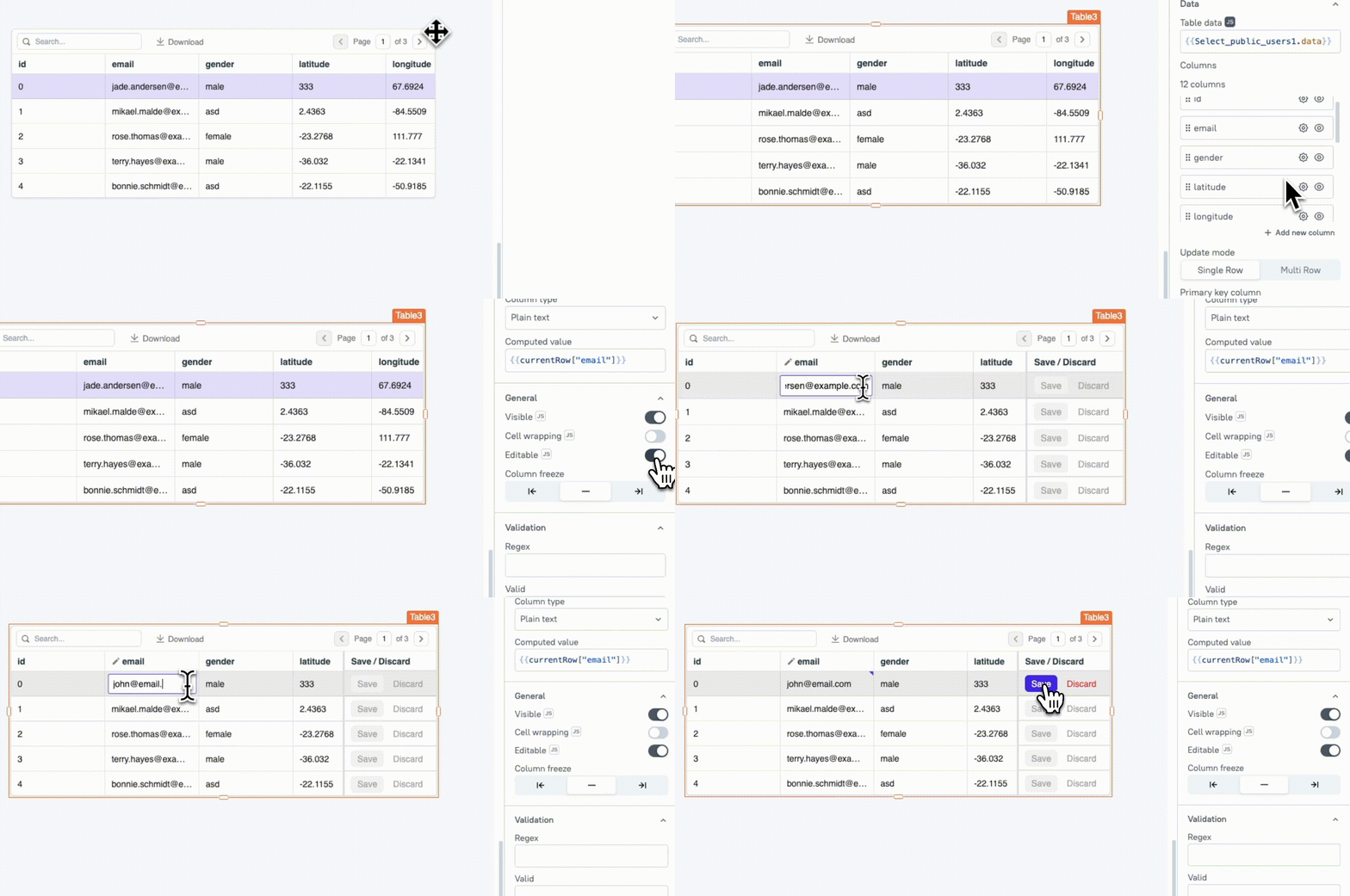
This page provides information related to all the editable column properties. You can enable the Editable property either by selecting the checkbox in the Table's column property settings or directly from the individual column settings. By enabling inline editing, users can update data directly from the UI by double-clicking on the desired cell
For more details on how to configure queries to edit or add rows using inline editing, see Edit Table Data Inline.

Properties
These common properties allow you to edit the column, and customize the user actions.
Validation
These properties help ensure user input follows specific rules to maintain data accuracy.
Regex string
The Regex property allows you to set custom validation for user input by specifying a regular expression pattern. If the input does not match this pattern, an error message is displayed.
Examples:
Email Validation: To validate whether an entered email is correct, use the following regular expression code inside the Regex property:
^(([^<>()\[\]\\.,;:\s@"]+(\.[^<>()\[\]\\.,;:\s@"]+)*)|(".+"))@((\[[0-9]{1,3}\.[0-9]{1,3}\.[0-9]{1,3}\.[0-9]{1,3}])|(([a-zA-Z\-0-9]+\.)+[a-zA-Z]{2,}))$
Phone number validation: If you want to validate international phone numbers starting with a plus sign (+) and a total length between 6 and 14 digits, use the following code inside the Regex property:
^\+(?:[0-9]●?){6,14}[0-9]$
Number validation: If you need to add number validation for fields like currency or prices, you can use the following regular expression code inside the Regex property:
//Regex

//Range Validation - 0 to 100:
^(0*100(\.0*)?)$|^([1-9]?[0-9](\.\d*)?)$

//Positive Number Validation:
^[1-9][0-9]*$

//Decimal Number Validation:
^-?\d+(\.\d{2})?$

//Minimum and Maximum Value Validation(1000 and 10,000):
Regex: ^(10000|[1-9][0-9]{3,4})$
Required boolean
Indicates whether the input for this column is mandatory. If set to true, users must provide a value before saving the column.
Valid boolean
This property allows you to define custom validation rules and error messages to guide users when their input does not meet the required criteria. To access the user's edited values, you can use the following reference properties:
- editedValue: This property shows the current value being edited in the column. It reflects what the user is typing or modifying in that specific cell.
Example: To validate that the input is longer than 2 characters, you can use:
{{ editedValue.length > 2 }}
- currentRow: This property holds the original, unedited values of the current row.
-
Editing Existing Rows: When editing, the
currentRowproperty shows the row’s original values and does not update dynamically. It reflects changes only after the Save button is clicked. -
Adding New Rows: When adding a new row, the
currentRowproperty represents the new row object.
Example: If you are editing a discount field in a Table, you might want to ensure that the discount percentage does not exceed the product's original price. To do this, compare the edited discount value with the price from the current row, as shown below:
{{ editedValue <= currentRow.price }}
- currentIndex: This property indicates the index of the row being edited or added.
-
Editing Existing Rows: For rows that already exist in the dataset,
currentIndexreflects the actual index of the row being edited. -
Adding New Rows: When adding a new row,
currentIndexis set to-1, indicating that the new row does not yet exist in the dataset.
{{ currentIndex >= 0 }}
- isNewRow: The
isNewRowproperty indicates if a new row is being added. It istruefor new rows, allowing you to apply specific logic for new entries. For existing rows, it isfalse.
{{ isNewRow }}
Min number
This property ensures that any value entered must be greater than or equal to the specified minimum. It is only available when the column type is set to Number, Currency, or Date.
Max number
This property ensures that any value entered must be less than or equal to the specified maximum. It is only available when the column type is set to Number, Currency, or Date.
Error Message string
This property allows customization of the error message displayed when the user enters an incorrect value. By default, the input widget shows a generic invalid input message.
Date settings
These editable properties become available only when the column type is set to Date.
First day of the week number
This property defines the starting day of the week in a Date field's calendar. For instance, setting it to 0 begins the week on Sunday, while 1 starts it on Monday. This setting can be adjusted according to regional or organizational preferences.
Show shortcuts boolean
When enabled, it adds section within the Datepicker pop-up that contains options - Today, 1 week ago, 1 month ago, 3 months ago, 1 year ago, for quick date selection.
Events
When the event is triggered, these event handlers can execute queries, JS functions, or other supported actions. These events may be available only for specific column types or when certain properties are enabled.
onSubmit
Allows you to configure one or multiple actions (Framework functions, queries, or JS functions) to be executed when the Save button of any input column type is clicked. This includes various column types such as Number, Plain Text, and more.
onOptionChange
Allows you to configure one or multiple actions (Framework functions, queries, or JS functions) to be executed when the user selects an option in the dropdown list. It enables you to capture the user's input and perform specific actions in response.
onFilterUpdate
This event allows you to configure one or multiple actions (Framework functions, queries, or JS functions) to be executed when you update the filter text. You can also write custom JavaScript logic for this event by clicking on the JS next to the property.
onChange
This event allows you to configure one or multiple actions to be executed in response to changes in the Switch state.
onDateSelected
This event allows you to configure one or multiple actions to be executed when a date is selected from the date column type.